
technophile.weebly.com was launched on 29/07/2011. Ever since its launch the site ran 3 main blogs: Technophile, Of life... and EngageIT. The Changelog followed shortly with details on what happens behind the scenes. Last week a certain post on the Changelog gave hint of a completely new branch of Technophile. After the break we delve deeper and deeper into an investigation which would yield spectacular clues as to the nature of this new branch!
Last week this post popped up on the Changelog:
Layout:
The homepage layout has been changed by rearranging some elements.
Readability:
Font color has been tweaked throughout the site for improved readability.
Design:
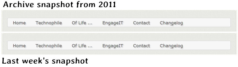
Question is: What microblogging service ? Our graphics analysts took high resolution snapshots of the website and compared them to archive ones from 2011 in the hopes of getting a hint as to what we could expect. Here are the 100% shots of the Menubar.
Layout:
The homepage layout has been changed by rearranging some elements.
Readability:
Font color has been tweaked throughout the site for improved readability.
Design:
- The menu bar has been improved with new hover animation and green highlights.
- All menu buttons now cast a discrete drop-shadow. This not only looks good but also improves readability and makes the menu text pop up.
- There's a new Technophile logo on the eponymous blog.
Question is: What microblogging service ? Our graphics analysts took high resolution snapshots of the website and compared them to archive ones from 2011 in the hopes of getting a hint as to what we could expect. Here are the 100% shots of the Menubar.
Notice anything different? No? How about now, with 200% magnification.

The differences are obvious at 400% magnification.We enhanced the last shot and enhanced it with advanced photo manipulation filters and the first letter of the new Menu Item is clear: it's a T!
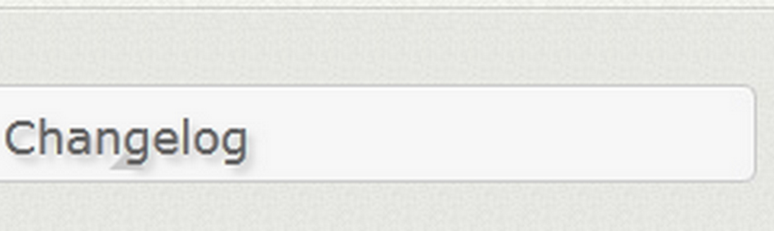
Considering how popular Twitter has become it's obvious that Technophile would not choose anything other than the world's best microblogging service which limits its posts to under a SMS length in character number!
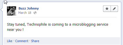
What created even more speculation was the mysterious Facebook post!
What created even more speculation was the mysterious Facebook post!
When will we be able to see this amazing expansion of out favorite tech-blog ? Only time will tell! We will be rolling updates as soon as we get them!